Chart
1. Overview
The Chart component is a versatile data visualization tool designed for the Stream platform dashboard. It provides comprehensive charting capabilities with support for multiple chart types, real-time data updates, and advanced configuration options.
This component is particularly effective for:
- Time Series Analysis: Displaying data trends over time
- Comparative Analysis: Comparing multiple datasets side by side
- Data Aggregation: Grouping and summarizing data by various time periods
- Multi-Axis Charts: Displaying data with different scales on separate axes
- Interactive Dashboards: Creating dynamic, user-interactive data displays
Key Features
- Multiple Chart Types: Line, Bar, Area, and other chart types
- Dual Y-Axis Support: Display data with different scales
- Data Aggregation: Group data by minute, hour, day, etc.
- Dynamic Select Integration: Runtime switching between data sources
- Customizable Styling: Full control over colors, fonts, and appearance
- Stacked Charts: Support for stacked bar and area charts
2. Configuration Steps
2.1 Panel Configuration
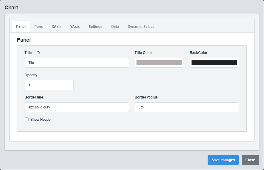
Panel Configuration tab showing basic appearance and layout settings for the chart component.
The Panel tab controls the basic appearance and layout of the chart component.
|
Parameter |
Description |
Format/Options |
Example |
|
Title |
Sets the display title for the chart panel |
Text string with optional Dynamic Select placeholders |
"System Performance - @{LABEL}" |
|
Title Color |
Defines the color of the chart title text |
Hex color code or CSS color name |
#b6adad |
|
Back Color |
Sets the background color for the entire chart panel |
Hex color code or CSS color name |
#222222 |
|
Opacity |
Controls the transparency level of the panel background |
0.0 (transparent) to 1.0 (opaque) |
1.0 |
|
Border Line |
Defines the border style for the container. Supports both full border and side-specific border styling |
CSS border syntax or side-specific syntax (semicolon-separated) |
1px solid gray |
|
Border Radius |
Sets the corner rounding for the panel |
CSS border-radius value |
0px |
|
Show Header |
Toggles the display of the panel header |
Checked/Unchecked |
Unchecked |
Note: The @{LABEL} and @{Value} placeholders in the Title field will be automatically replaced with the selected Dynamic Select label when Dynamic Select is configured and active.
2.2 Pens Configuration
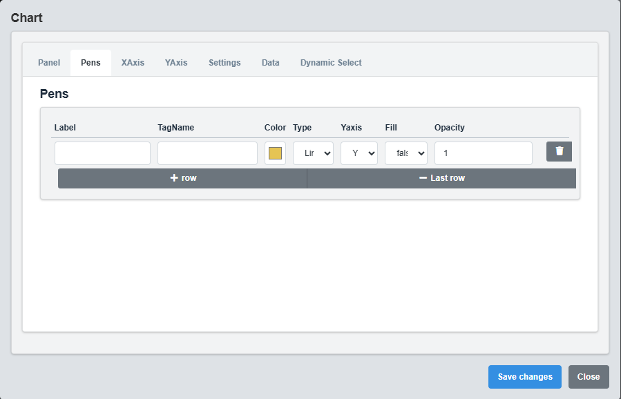
Pens Configuration tab showing settings for individual data series (pens) in the chart.
Each pen represents a separate data series in the chart. You can configure multiple pens to display different datasets.
|
Parameter |
Description |
Format/Options |
Example |
|
Label |
Display name for the data series in the legend |
Text string with optional Dynamic Select placeholders |
"Temperature @{LABEL}" |
|
TagName |
Data source tag for this pen |
Tag name with optional Dynamic Select placeholders |
"System.Temp_@{Value}" |
|
Color |
Sets the color for this data series |
Hex color code |
#E5C454 |
|
Type |
Chart type for this data series |
line, bar, area |
line |
|
Y Axis |
Which Y-axis to use for this data series |
Y1, Y2 |
Y1 |
|
Fill |
Whether to fill the area under the line (for line/area charts) |
true/false |
false |
|
Opacity |
Controls the transparency of the filled area |
0.0 to 1.0 |
1.0 |
Chart Type Options
Line
Continuous line connecting data points. Best for showing trends over time.
Bar
Vertical bars representing data values. Good for comparing discrete values.
Area
Filled area under the line. Emphasizes the magnitude of change over time.
2.3 X-Axis Configuration
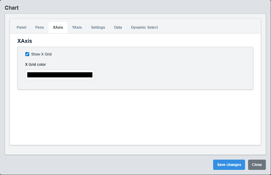
X-Axis Configuration tab showing settings for horizontal axis grid lines and styling.
Controls the horizontal (X) axis appearance and behavior.
|
Parameter |
Description |
Default |
Example |
|
Show X Grid |
Enables or disables vertical grid lines |
true |
true |
|
X Grid Color |
Sets the color of vertical grid lines |
gray |
#808080 |
2.4 Y-Axis Configuration
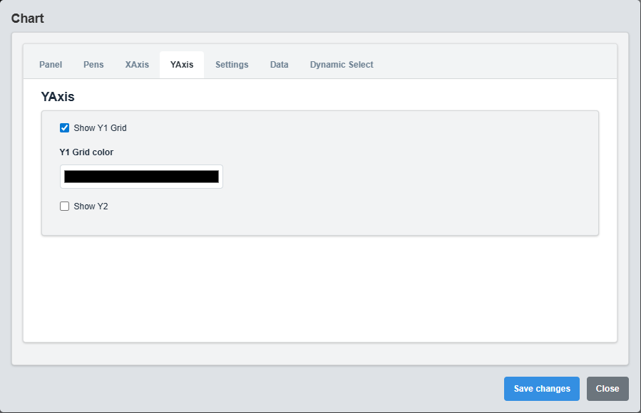
Y-Axis Configuration tab showing settings for left and right Y-axis configuration.
Controls the vertical (Y) axes appearance and behavior. Supports dual Y-axis configuration.
|
Parameter |
Description |
Default |
Example |
|
Show Y1 Grid |
Enables or disables horizontal grid lines for left Y-axis |
true |
true |
|
Y1 Grid Color |
Sets the color of horizontal grid lines for left Y-axis |
gray |
#808080 |
|
Show Y2 |
Enables or disables the right Y-axis |
false |
true |
|
Show Y2 Grid |
Enables or disables horizontal grid lines for right Y-axis |
false |
true |
|
Y2 Grid Color |
Sets the color of horizontal grid lines for right Y-axis |
gray |
#808080 |
Dual Y-Axis Usage: Enable Y2 axis when you need to display datasets with different scales. For example, temperature (°C) on the left axis and pressure (bar) on the right axis.
2.5 Chart Settings
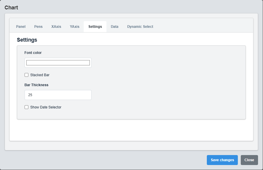
Chart Settings tab showing general behavior and appearance settings for the chart.
The Settings tab controls the general behavior and appearance of the chart.
|
Parameter |
Description |
Options |
Default |
|
Font Color |
Sets the color for all text elements |
Hex color code or CSS color name |
#ffffff |
|
Stacked Bar |
Enables stacked bar chart mode |
true/false |
false |
|
Bar Thickness |
Sets the thickness of bars in bar charts |
Numeric value (pixels) |
25 |
|
Date Picker Show Selected Date |
Shows selected date in date picker |
true/false |
false |
2.6 Data Configuration
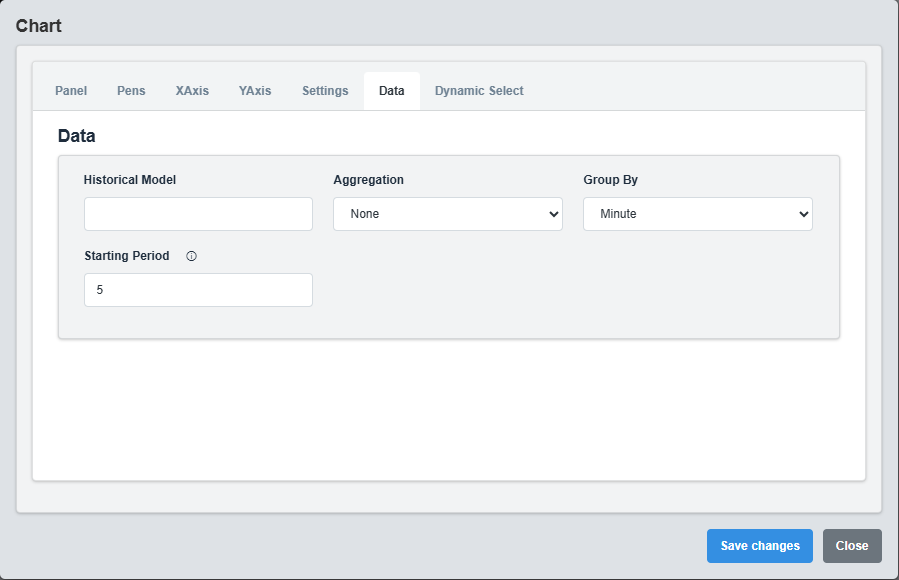
Data Configuration tab showing settings for data model, aggregation, and grouping options.
The Data tab controls how data is retrieved, processed, and displayed in the chart.
|
Parameter |
Description |
Options |
Default |
|
Model |
Data model or source identifier |
Text string |
Empty string |
|
Aggregation |
Method for aggregating data points |
none, average, sum, min, max, count |
none |
|
Group By |
Time period for grouping data |
second, minute, hour, day, week, month |
minute |
|
Starting Period |
Number of time periods to look back |
Numeric value |
5 |
Data Aggregation Options
- none: No aggregation, display raw data points
- average: Calculate average value for each time period
- sum: Sum all values within each time period
- min: Display minimum value for each time period
- max: Display maximum value for each time period
- count: Count number of data points in each time period
2.7 Dynamic Select Configuration
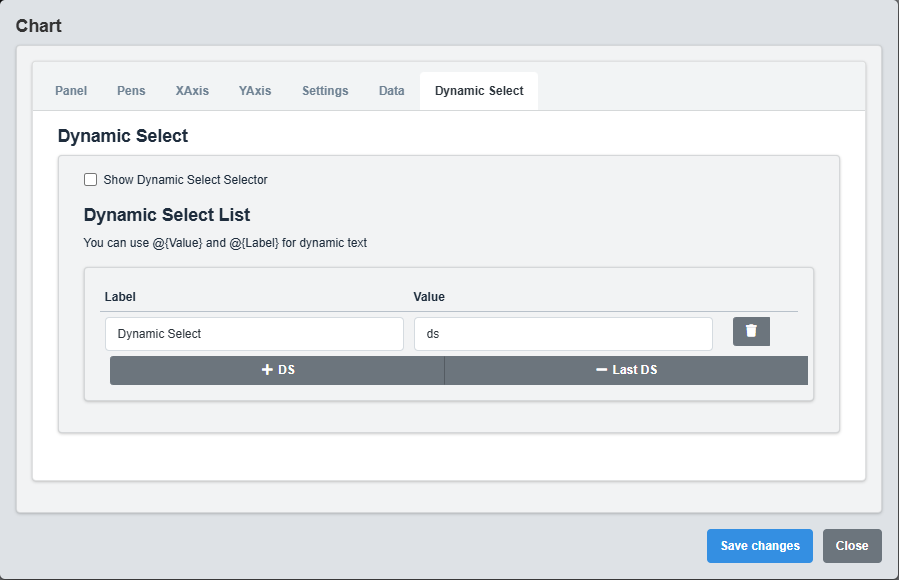
Dynamic Select Configuration tab showing settings for runtime data source switching.
The DS (Dynamic Select) tab enables runtime switching between different data sources.
|
Parameter |
Description |
Default |
Example |
|
Show DS Selector |
Enables or disables the Dynamic Select dropdown |
false |
true |
|
DS List |
Array of available data sources for selection |
Empty array |
See example below |
Dynamic Select Placeholders
- @{Value}: Replaced with the selected DS value
- @{LABEL}: Replaced with the selected DS display label
3. Troubleshooting
Common Issues and Solutions
|
Issue |
Possible Causes |
Solutions |
|
Chart not displaying data |
Incorrect tag names, data source not available, invalid data format |
Verify tag names are correct and data sources are properly configured |
|
Y-axis scale issues |
Data range mismatch, axis configuration problems |
Verify Y-axis settings and data ranges |
|
Dynamic Select not working |
DS configuration not properly set up, invalid DSList entries |
Ensure DS configuration is properly set up with valid DSList entries |