Layout
1. Overview
The Layout Properties interface allows you to configure the overall appearance and behavior of your Stream Platform dashboard. This includes settings for the main body, navigation menu, top bar, and content areas.
Key Features
- Main Body Configuration: Background colors, images, and spacing
- Left Menu Settings: Visibility, colors, fonts, and dimensions
- Top Bar Customization: Colors, height, and appearance
- Content Items: Header text, styling, and positioning
- Real-time Preview: See changes as you configure
- Save Layout: Apply all changes with one click
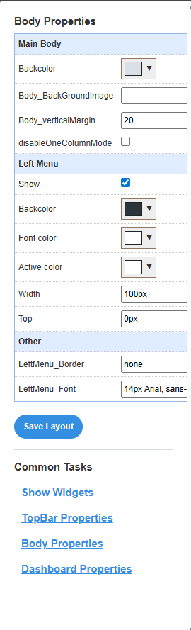
2. Body Properties Configuration
The Body Properties interface is organized into several sections, each controlling different aspects of your dashboard layout.
Interface Sections
Main Body
Controls the overall page background, images, and spacing settings.
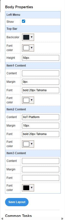
Left Menu
Configures the navigation menu visibility, colors, and dimensions.
Top Bar
Sets the header bar colors, fonts, and height.
Content Items
Manages header text elements and their styling.
3. Main Body Settings
Configure the overall appearance and behavior of the main dashboard body.
Main Body Properties
|
Property |
Description |
Type |
Default Value |
Example |
|
Backcolor |
Background color of the main body |
Color |
White/Transparent |
#ffffff, #f8f9fa |
|
Body_BackGroundImage |
Background image for the main body |
String |
Empty |
background.jpg, pattern.png |
|
Body_verticalMargin |
Vertical margin spacing for the body |
Number |
20 |
10, 20, 30 |
|
DisableOneColumnMode |
Disable single column layout mode |
Boolean |
False (unchecked) |
True/False |
Background Image: Upload your background image to the StaticResources folder first, then enter the filename in the Body_BackGroundImage field.
One Column Mode: When disabled, the layout will always use the configured grid system. When enabled, it may switch to single column on smaller screens.
4. Left Menu Configuration
Configure the navigation menu that appears on the left side of the dashboard.
Left Menu Properties
|
Property |
Description |
Type |
Default Value |
Example |
|
Show |
Display the left menu |
Boolean |
True (checked) |
True/False |
|
Backcolor |
Background color of the menu |
Color |
Black |
#000000, #2c3e50 |
|
Font color |
Color of menu text |
Color |
White |
#ffffff, #ecf0f1 |
|
Active color |
Color of active menu item |
Color |
White |
#ffffff, #3498db |
|
Width |
Width of the left menu |
String |
100px |
100px, 200px, 15% |
|
Top |
Top position offset |
String |
0px |
0px, 10px, 20px |
|
LeftMenu_Border |
Border style for the menu |
String |
none |
none, 1px solid #ccc |
|
LeftMenu_Font |
Font family and size for menu text |
String |
14px Arial, sans- |
14px Arial, 16px 'Segoe UI' |
Color Coordination: Choose colors that provide good contrast for readability. Dark backgrounds work well with light text.
Width Settings: Use pixel values for fixed widths or percentage values for responsive design.
5. Top Bar Settings
Configure the header bar that appears at the top of the dashboard.
Top Bar Properties
|
Property |
Description |
Type |
Default Value |
Example |
|
Backcolor |
Background color of the top bar |
Color |
Black |
#000000, #34495e |
|
Font color |
Color of text in the top bar |
Color |
White |
#ffffff, #ecf0f1 |
|
Height |
Height of the top bar |
String |
50px |
40px, 50px, 60px |
Height Considerations: Ensure the top bar height accommodates your content and doesn't interfere with other elements.
6. Content Items Configuration
Configure the content items that appear in the header area of your dashboard.
Content Item Properties
Each content item (Item1, Item2, Item3) can be configured with the following properties:
|
Property |
Description |
Type |
Default Value |
Example |
|
Content |
Text content to display |
String , Image name |
Empty |
"IIoT Platform", "Dashboard" |
|
Margin |
Margin spacing around the content |
String |
0px |
0px, 10px, 20px |
|
Font |
Font family, weight, and size |
String |
bold 20px Tahoma |
bold 20px Tahoma, 16px Arial |
|
Font color |
Color of the text |
Color |
White |
#ffffff, #2c3e50 |
Content Items Usage: Use these items for header text, titles, or branding elements. Leave empty items unused.
Font Configuration: Use CSS font syntax: "weight size family" (e.g., "bold 20px Tahoma").
9. Troubleshooting
Common Issues
Layout Not Saving: Ensure you click "Save Layout" after making changes. Changes are not applied until saved.
Colors Not Displaying: Check that color values are in valid format (hex codes like #ffffff or named colors).
Background Image Not Showing: Verify the image file exists in the StaticResources folder and the filename is correct.
Validation Tips
- Color Format: Use hex codes (#ffffff) or valid CSS color names
- Size Values: Include units (px, %, em) with size values
- Font Syntax: Use proper CSS font syntax: "weight size family"
- File Paths: Use relative paths for images and resources