Numeric Input
1. Overview
The Numeric Input component is a specialized input widget designed for the Stream platform dashboard. It provides a user-friendly interface for entering numeric values with validation, range checking, and access control. The component supports real-time data updates and provides immediate feedback for user input, making it perfect for parameter configuration and data entry tasks.
This component is particularly effective for:
- Parameter Configuration: Setting system parameters and configuration values
- Data Entry: Entering numeric values with validation
- Range Control: Input validation within specified min/max ranges
- Access Control: Restricting input access based on user permissions
- Real-Time Updates: Live data updates from PLC/SCADA systems
- User Interface: Interactive numeric input for dashboard controls
Key Features
- Numeric Validation: Input validation for numeric values only
- Range Checking: Min/max range validation for input values
- Access Control: Configurable access levels for security
- Real-Time Updates: Live data updates from data sources
- Interactive Interface: User-friendly input with immediate feedback
- Customizable Styling: Full control over appearance and colors
- Focus Management: Smart focus handling and input clearing
- OK/Cancel Actions: Confirmation controls for input changes
2. Configuration Steps
2.1 Panel Configuration
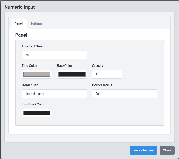
Panel Configuration tab showing basic appearance and layout settings for the numeric input component.
The Panel tab controls the basic appearance and layout of the numeric input component.
|
Parameter |
Description |
Format/Options |
Example |
|
Text Size |
Font size for the input text |
Numeric value |
20 |
|
Title Color |
Color of the input label text |
Hex color code or CSS color name |
#b6adad |
|
Back Color |
Background color for the input container |
Hex color code or CSS color name |
#222222 |
|
Input Back Color |
Background color for the input field |
Hex color code or CSS color name |
#222222 |
|
Opacity |
Controls the transparency level of the component |
0.0 (transparent) to 1.0 (opaque) |
1.0 |
|
Border Line |
Defines the border style for the input container |
CSS border syntax |
1px solid gray |
|
Border Radius |
Sets the corner rounding for the input container |
CSS border-radius value |
0px |
2.2 Settings Configuration
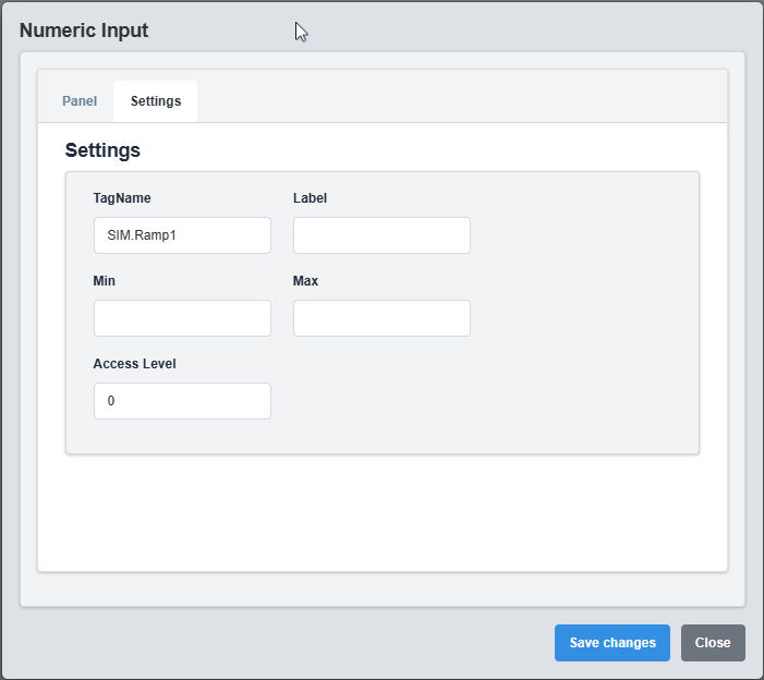
Settings Configuration tab showing input validation, range settings, and access control options.
The Settings tab controls the input validation, range checking, and access control for the numeric input.
|
Parameter |
Description |
Format/Options |
Example |
|
Label |
Display label for the input field |
Text string |
Temperature Setpoint |
|
Tag Name |
Data source tag for the input value |
Tag name string |
SIM.Ramp1 |
|
Min Range |
Minimum allowed input value |
Numeric value |
0 |
|
Max Range |
Maximum allowed input value |
Numeric value |
100 |
|
Min Access Level |
Minimum access level required to use input |
Numeric value (0-100) |
0 |
Input Validation Example
Label: "Temperature Setpoint" Tag Name: "SIM.TempSetpoint" Min Range: 0 Max Range: 100 Min Access Level: 1
Range Validation: The min and max range values provide input validation to ensure users enter values within acceptable limits.
3. Troubleshooting
Common Issues and Solutions
|
Issue |
Possible Causes |
Solutions |
|
Input not accepting values |
Access level too high, range validation |
Check access level and range settings |
|
Values not updating |
Incorrect tag name, data source not active |
Verify tag name and data source connection |
|
Range validation not working |
Min/max range not configured |
Set appropriate min and max range values |
|
Input not visible |
Opacity set to 0, color conflicts |
Check opacity and color settings |