Pie Chart
1. Overview
The Pie Chart component is a powerful data visualization widget designed for the Stream platform dashboard. It provides multiple chart types including Pie, Doughnut, and Polar Area charts, making it perfect for displaying proportional data, percentages, and categorical information in an intuitive circular format.
This component is particularly effective for:
- Data Distribution: Showing how data is distributed across different categories
- Percentage Analysis: Displaying proportional relationships and percentages
- Category Comparison: Comparing different categories or segments
- KPI Dashboards: Visualizing key performance indicators
- Survey Results: Displaying survey data and responses
- Resource Allocation: Showing resource distribution and usage
Key Features
- Multiple Chart Types: Pie, Doughnut, and Polar Area charts
- Dynamic Data: Real-time data updates from PLC/SCADA systems
- Customizable Legend: Configurable legend position, font, and style
- Color Management: Custom colors for each data segment
- Interactive Elements: Hover effects and click interactions
- Dynamic Select: Runtime data source switching
- Grid Configuration: Radial and angle grid customization
- Responsive Design: Adapts to different screen sizes
2. Configuration Steps
2.1 Panel Configuration
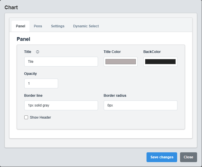
Panel Configuration tab showing basic appearance and layout settings for the pie chart component.
The Panel tab controls the basic appearance and layout of the pie chart component.
|
Parameter |
Description |
Format/Options |
Example |
|
Title |
Sets the display title for the XY chart panel |
Text string with optional Dynamic Select placeholders |
"Process Analysis - @{DS_LABEL}" |
|
Title Color |
Defines the color of the chart title text |
Hex color code or CSS color name |
#b6adad |
|
Back Color |
Sets the background color for the entire XY chart panel |
Hex color code or CSS color name |
#222222 |
|
Opacity |
Controls the transparency level of the panel background |
0.0 (transparent) to 1.0 (opaque) |
1.0 |
|
Border Line |
Defines the border style for the container. Supports both full border and side-specific border styling |
Defines the border style for the alarm container. Supports both full border and side-specific border styling |
1px solid gray |
|
Border Radius |
Sets the corner rounding for the panel |
CSS border-radius value |
0px |
|
Show Header |
Toggles the display of the panel header |
Checked/Unchecked |
Unchecked |
2.2 Pens Configuration
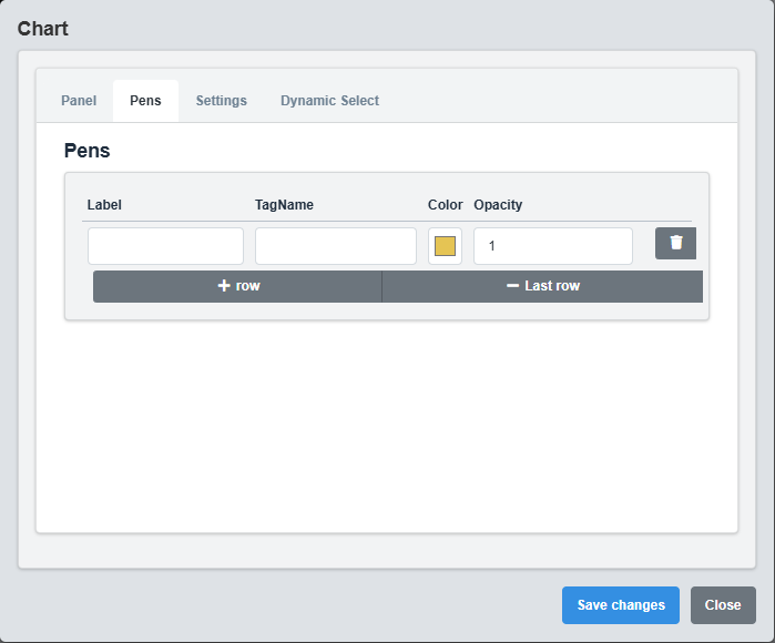
Pens Configuration tab showing data series configuration for the pie chart segments.
The Pens tab controls the data series for each segment of the pie chart.
|
Parameter |
Description |
Format/Options |
Example |
|
Label |
Display name for this data series |
Text string |
Production Line A |
|
Tag Name |
Data source tag for this series |
Tag name string |
SIM.ProductionA |
|
Color |
Color for this data series segment |
Hex color code |
#E5C454 |
|
Opacity |
Transparency level for this segment |
0.0 (transparent) to 1.0 (opaque) |
1.0 |
Data Series: Each pen represents a data series that will appear as a segment in the pie chart. You can add multiple pens to create multi-segment charts.
2.3 Settings Configuration
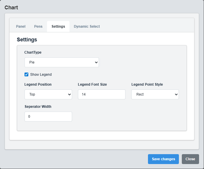
Settings Configuration tab showing chart type options and basic settings for pie chart.
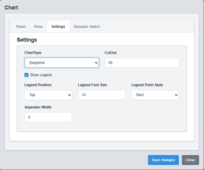
Settings Configuration tab showing doughnut chart specific settings including cutout configuration.
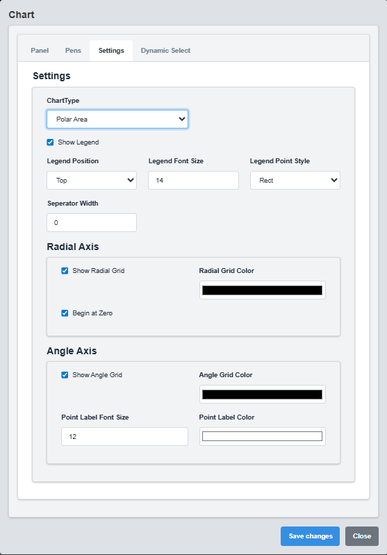
Settings Configuration tab showing polar area chart configuration with radial and angle axis settings.
The Settings tab controls the chart type, legend configuration, and grid settings.
|
Parameter |
Description |
Format/Options |
Example |
|
Chart Type |
Type of chart to display |
Pie, Doughnut, Polar |
Pie |
|
Cut Out |
Inner radius for doughnut chart (percentage) |
0-100 |
50 |
|
Show Legend |
Display the chart legend |
true/false |
true |
|
Legend Position |
Position of the legend |
top, bottom, left, right |
top |
|
Legend Font Size |
Font size for legend text |
Numeric value |
14 |
|
Legend Point Style |
Style of legend markers |
Rect, Circle |
Rect |
|
Separator Width |
Width of separators between segments |
0-10 |
0 |
Radial Axis Configuration (Polar Charts)
|
Parameter |
Description |
Format/Options |
Example |
|
Show Radial Grid |
Display radial grid lines |
true/false |
true |
|
Radial Grid Color |
Color of radial grid lines |
Hex color code |
gray |
|
Begin At Zero |
Start radial axis at zero |
true/false |
true |
Angle Axis Configuration (Polar Charts)
|
Parameter |
Description |
Format/Options |
Example |
|
Show Angle Grid |
Display angle grid lines |
true/false |
true |
|
Angle Grid Color |
Color of angle grid lines |
Hex color code |
gray |
|
Point Label Font Size |
Font size for point labels |
Numeric value |
12 |
|
Point Label Color |
Color of point labels |
Hex color code |
#ffffff |
Chart Type Selection: Choose the appropriate chart type based on your data visualization needs. Pie charts are best for simple proportions, doughnut charts for emphasizing the whole, and polar charts for showing data distribution across angles.
2.4 Dynamic Select Configuration
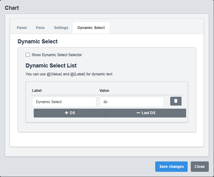
Dynamic Select Configuration tab showing settings for runtime data source switching.
The Dynamic Select tab enables runtime switching between different data sources using placeholders.
|
Parameter |
Description |
Format/Options |
Example |
|
Show DS Selector |
Enable dynamic select functionality |
true/false |
false |
|
Label |
Display name for this data source |
Text string |
Dynamic Select |
|
Value |
Value used in tag name replacement |
Text string |
ds |
Dynamic Select Placeholders
Use these placeholders in tag names to enable dynamic data source switching:
- @{DS} - Replaced with the selected data source value
- @{DS_LABEL} - Replaced with the selected data source label
Example Tag Names with Dynamic Select: - SIM.@{DS}.Temperature - PLC.@{DS_LABEL}.Pressure - @{DS}.Sensor.Value
Dynamic Select Usage: This feature allows users to switch between different data sources at runtime without modifying the chart configuration, making it ideal for multi-plant or multi-process monitoring.
3. Troubleshooting
Common Issues and Solutions
|
Issue |
Possible Causes |
Solutions |
|
Chart not displaying data |
Incorrect tag names, no data in pens |
Verify tag names and ensure pens are configured |
|
Legend not showing |
Show Legend disabled, no pens configured |
Enable Show Legend and configure pens |
|
Colors not applying |
Invalid color codes, opacity issues |
Check color format and opacity values |
|
Dynamic Select not working |
Show DS Selector disabled, incorrect placeholders |
Enable DS Selector and verify placeholder syntax |
|
Chart not updating |
Data source not active, tag names incorrect |
Verify data source and tag name configuration |