Grid
1. Overview
The Grid component is a powerful data grid widget designed for the Stream platform dashboard. It provides comprehensive data management capabilities with real-time synchronization, CRUD operations, and advanced filtering. The component integrates with external APIs to provide dynamic data loading, editing, and management functionality.
This component is particularly effective for:
- Data Management: Display, edit, add, and delete data records
- Real-Time Updates: Live data synchronization with external systems
- Data Visualization: Present structured data in organized rows and columns
- User Interaction: Enable users to interact with data through forms and actions
- Data Export: Export data to Excel and PDF formats
- Advanced Filtering: Filter and search data with multiple criteria
Key Features
- CRUD Operations: Create, Read, Update, Delete data records
- Real-Time Sync: Live data synchronization with external APIs
- Custom Columns: Configurable columns with different data types
- Action Buttons: Custom action buttons for row operations
- Data Export: Excel and PDF export capabilities
- Advanced Filtering: Multiple filter options and search functionality
- Format Rules: Conditional formatting based on data values
- Responsive Design: Adapts to different screen sizes
2. Configuration Steps
2.1 Panel Configuration
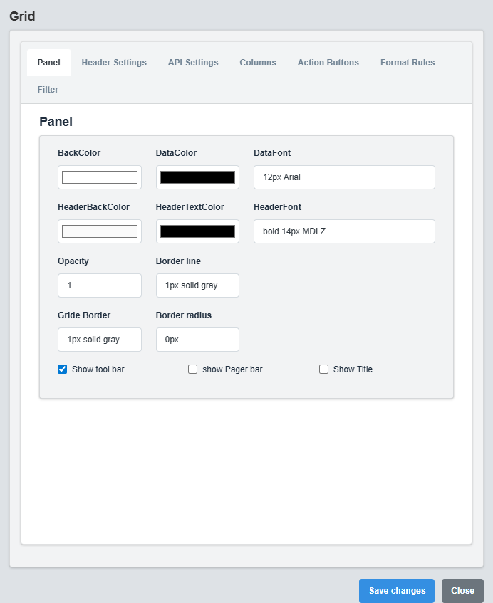
Panel Configuration tab showing basic appearance and layout settings for the SyncGrid component.
The Panel tab controls the basic appearance and layout of the SyncGrid component.
|
Parameter |
Description |
Format/Options |
Example |
|
Back Color |
Background color for the grid container |
Hex color code or CSS color name |
#ffffff |
|
Data Color |
Text color for grid data |
Hex color code or CSS color name |
#000000 |
|
Data Font |
Font style for grid data |
CSS font syntax |
12px Arial |
|
Opacity |
Transparency level of the grid container |
0.0 (transparent) to 1.0 (opaque) |
1.0 |
|
Border |
Defines the border style for the container. Supports both full border and side-specific border styling |
CSS border syntax or side-specific syntax (semicolon-separated) |
1px solid gray or left: 2px solid red; top: 1px solid blue |
|
Grid Border |
Border style for the grid itself |
CSS border syntax |
1px solid gray |
|
Border Radius |
Corner rounding for the grid container |
CSS border-radius value |
0px |
|
Show Toolbar |
Display the grid toolbar |
true/false |
true |
|
Show Pager |
Display pagination controls |
true/false |
false |
|
Show Title |
Display grid title |
true/false |
false |
|
Title |
Grid title text |
Text string |
Sync Grid |
2.2 Header Settings Configuration
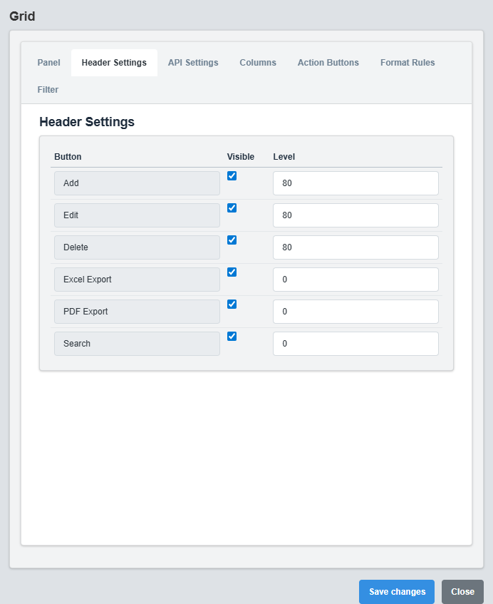
Header Settings Configuration tab showing toolbar button configuration.
The Header Settings tab configures which toolbar buttons are displayed.
|
Parameter |
Description |
Format/Options |
Example |
|
Add Button |
Show add new record button |
true/false |
true |
|
Edit Button |
Show edit record button |
true/false |
true |
|
Delete Button |
Show delete record button |
true/false |
true |
|
Excel Export |
Show Excel export button |
true/false |
true |
|
PDF Export |
Show PDF export button |
true/false |
true |
|
Search |
Show search functionality |
true/false |
true |
Toolbar Configuration: Enable or disable specific toolbar buttons based on your requirements. This allows you to customize the user interface for different use cases.
2.3 API Settings Configuration
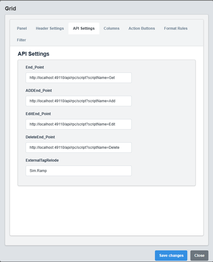
API Settings Configuration tab showing API endpoints and data source configuration.
The API Settings tab configures the data source and CRUD operation endpoints.
|
Parameter |
Description |
Format/Options |
Example |
|
End Point |
API endpoint for reading data |
Valid URL string |
http://localhost:49110/api/rpc/script?scriptName=Get |
|
Add End Point |
API endpoint for adding new records |
Valid URL string |
http://localhost:49110/api/rpc/script?scriptName=Add |
|
Edit End Point |
API endpoint for updating records |
Valid URL string |
http://localhost:49110/api/rpc/script?scriptName=Edit |
|
Delete End Point |
API endpoint for deleting records |
Valid URL string |
http://localhost:49110/api/rpc/script?scriptName=Delete |
|
External Tag Reload |
Tag that triggers data reload when value changes |
Tag name string |
Sim.Ramp |
API Integration: Configure separate endpoints for different operations. The External Tag Reload feature allows automatic data refresh when a specific tag value changes.
2.4 Columns Configuration
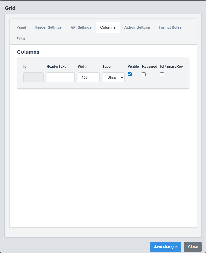
Columns Configuration tab showing column definitions and data types.
The Columns tab defines the structure and behavior of grid columns.
|
Parameter |
Description |
Format/Options |
Example |
|
Id |
Unique identifier for the column |
Text string |
id |
|
Visible |
Whether the column is visible |
true/false |
true |
|
Width |
Column width in pixels |
Numeric value |
100 |
|
Type |
Data type for the column |
string, number, date, boolean |
string |
|
Header Text |
Display text for column header |
Text string |
Name |
|
Required |
Whether the column is required for editing |
true/false |
false |
|
Is Primary Key |
Whether this column is the primary key |
true/false |
false |
Column Types: Choose appropriate data types for each column. String for text data, number for numeric values, date for date/time data, and boolean for true/false values.
2.5 Action Buttons Configuration
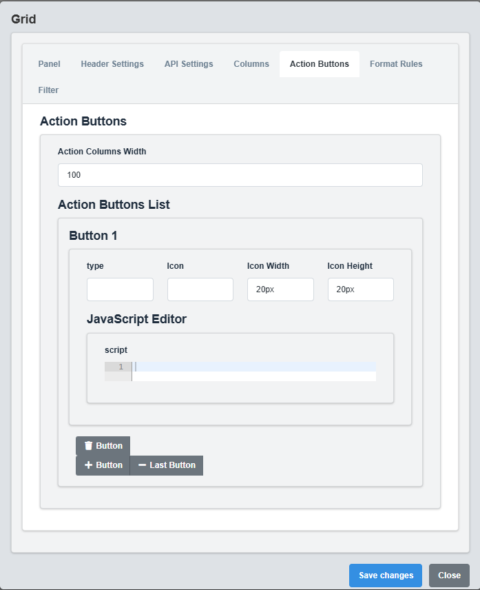
Action Buttons Configuration tab showing custom action button settings.
The Action Buttons tab configures custom action buttons for each row.
|
Parameter |
Description |
Format/Options |
Example |
|
Type |
Button type identifier |
Text string |
edit |
|
Icon |
Icon image for the button |
Image filename from StaticResources |
edit.png |
|
Image Width |
Width of the button icon |
CSS size value |
20px |
|
Image Height |
Height of the button icon |
CSS size value |
20px |
|
Action |
JavaScript function to execute |
JavaScript function string |
(rowData) => alert(`Editing ${rowData.id}`) |
Custom Actions: Action buttons allow you to add custom functionality to each row. Use JavaScript functions to define the behavior when buttons are clicked.
2.6 Format Rules Configuration
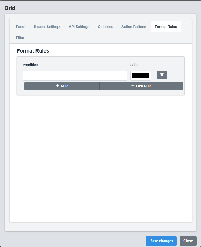
Format Rules Configuration tab showing conditional formatting rules.
The Format Rules tab configures conditional formatting for grid rows.
|
Parameter |
Description |
Format/Options |
Example |
|
Condition |
JavaScript condition for formatting |
JavaScript expression |
@{status} === 'Active' |
|
Color |
Background color when condition is true |
Hex color code or CSS color name |
#d4edda |
Conditional Formatting: Use JavaScript expressions to define conditions for row formatting. The condition is evaluated for each row, and the specified color is applied when the condition is true.
4. Troubleshooting
Common Issues and Solutions
|
Issue |
Possible Causes |
Solutions |
|
Grid not loading data |
Invalid API endpoint, network issues, incorrect response format |
Check API endpoint URL, verify network connection, ensure response format matches expected structure |
|
CRUD operations failing |
Invalid API endpoints, missing required fields, authentication issues |
Verify all API endpoints are correct, check required field configuration, ensure proper authentication |
|
Columns not displaying |
Incorrect column configuration, missing header text |
Check column configuration, ensure all required fields are set, verify column visibility settings |
|
Action buttons not working |
Invalid JavaScript functions, missing image files |
Check JavaScript function syntax, verify image files exist in StaticResources folder |
|
Filtering not working |
Filter not enabled, incorrect filter configuration |
Enable filtering in configuration, check filter type settings |