List
1. Overview
The List component is a versatile data display widget designed for the Stream platform dashboard. It provides a structured way to display lists of items with labels, values, and status indicators. The component supports LED indicators, and real-time data updates, making it perfect for displaying status lists, data summaries, and monitoring information.
This component is particularly effective for:
- Status Lists: Display system status and monitoring information
- Data Summaries: Show key metrics and values in list format
- Monitoring Displays: Real-time monitoring of multiple data points
- Configuration Lists: Display configuration parameters and settings
- Alert Lists: Show alerts and notifications in organized format
- Process Monitoring: Monitor multiple process variables simultaneously
Key Features
- Structured Display: Organized list format with labels and values
- LED Indicators: Visual status indicators for each list item
- Real-Time Updates: Live data updates from PLC/SCADA systems
- Customizable Styling: Full control over colors and appearance
- Row-based Layout: Flexible row configuration for different data types
- Status Visualization: Visual feedback for different states
- Responsive Design: Adapts to different screen sizes
2. Configuration Steps
2.1 Panel Configuration
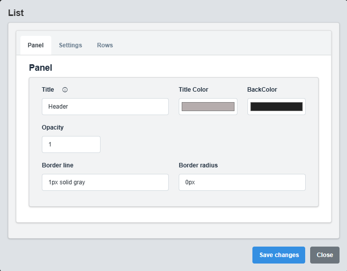
Panel Configuration tab showing basic appearance and layout settings for the list component.
The Panel tab controls the basic appearance and layout of the list component.
|
Parameter |
Description |
Format/Options |
Example |
|
Title |
Sets the display title for the list |
Text string |
Header |
|
Title Color |
Sets the color of the title text |
Hex color code or CSS color name |
#b6adad |
|
Back Color |
Sets the background color for the list container |
Hex color code or CSS color name |
#222222 |
|
Opacity |
Controls the transparency level of the list container |
0.0 (transparent) to 1.0 (opaque) |
1.0 |
|
Border Line |
Defines the border style for the container. Supports both full border and side-specific border styling |
CSS border syntax or side-specific syntax (semicolon-separated) |
1px solid gray or left: 2px solid red; top: 1px solid blue |
|
Border Radius |
Sets the corner rounding for the list container |
CSS border-radius value |
0px |
Container Styling: The panel settings control the container that holds the list, providing the overall appearance and layout structure.
2.2 Settings Configuration

Settings Configuration tab showing display options, LED settings, and appearance configuration.
The Settings tab controls the display options, LED indicators, and overall appearance of the list.
|
Parameter |
Description |
Format/Options |
Example |
|
Font Color |
Color of the text in list items |
Hex color code or CSS color name |
white |
|
Back Color |
Background color for list items |
Hex color code or CSS color name |
gray |
|
Show LEDs |
Display LED status indicators |
true/false |
false |
|
Rectangle LED |
Use rectangular LED indicators instead of circular |
true/false |
false |
|
Dark Mode |
Enable dark mode styling |
true/false |
true |
LED Indicators: When enabled, LED indicators provide visual status feedback for each list item based on the configured status tags and colors.
2.3 Rows Configuration
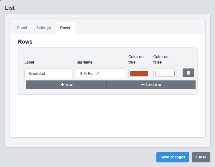
Rows Configuration tab showing list item configuration and data source settings.
The Rows tab controls the individual list items and their data sources.
|
Parameter |
Description |
Format/Options |
Example |
|
Label |
Display label for the list item |
Text string |
Simulated |
|
Tag Name |
Data source tag for the list item value |
Tag name string |
SIM.Ramp1 |
|
Status Colors |
Colors for different status values |
Color mapping (e.g., 0:red, 1:green) |
0:#ff0000, 1:#00ff00 |
3. Troubleshooting
Common Issues and Solutions
|
Issue |
Possible Causes |
Solutions |
|
List not displaying data |
Incorrect tag names, no rows configured |
Verify tag names and ensure rows are properly configured |
|
LEDs not showing |
Show LEDs disabled, no status tags configured |
Enable Show LEDs and configure status tags |
|
Values not updating |
Data source not active, incorrect tag names |
Check data source and verify tag name configuration |
|
Colors not applying |
Invalid color codes, dark mode conflicts |
Check color format and dark mode settings |
|
Text not visible |
Font color same as background, opacity issues |
Adjust font color and check opacity settings |