Select
1. Overview
The Select component is a versatile dropdown selection widget designed for the Stream platform dashboard. It provides a user-friendly interface for selecting from predefined options with API integration, feedback tags, and customizable styling. The component supports both static option lists and dynamic data sources, making it perfect for configuration selection and data filtering.
This component is particularly effective for:
- Configuration Selection: Choose from predefined configuration options
- Data Filtering: Filter data based on selected criteria
- Mode Selection: Switch between different operational modes
- API Integration: Connect to external data sources for options
- User Interface: Provide interactive selection controls
Key Features
- Dropdown Selection: User-friendly dropdown interface
- API Integration: Connect to external APIs for dynamic options
- Feedback Tags: Real-time feedback on selection changes
- Customizable Options: Configure labels, values, and tags
- Real-Time Updates: Live data updates from PLC/SCADA systems
- Flexible Styling: Full control over appearance and colors
- Responsive Design: Adapts to different screen sizes
2. Configuration Steps
2.1 Panel Configuration
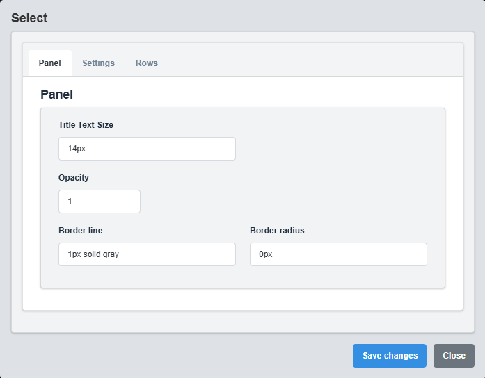
Panel Configuration tab showing basic appearance and layout settings for the select component.
The Panel tab controls the basic appearance and layout of the select component.
|
Parameter |
Description |
Format/Options |
Example |
|
Opacity |
Controls the transparency level of the select component |
0.0 (transparent) to 1.0 (opaque) |
1.0 |
|
Text Size |
Font size for the select text |
CSS font-size value |
14px |
|
Border Line |
Defines the border style for the container. Supports both full border and side-specific border styling |
CSS border syntax or side-specific syntax (semicolon-separated) |
1px solid gray or left: 2px solid red; top: 1px solid blue |
|
Border Radius |
Sets the corner rounding for the select component |
CSS border-radius value |
0px |
2.2 Settings Configuration
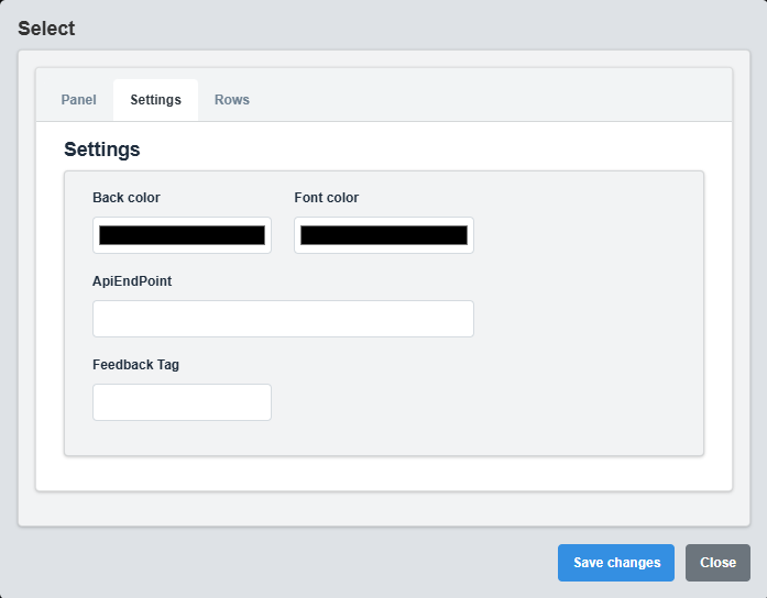
Settings Configuration tab showing display options, API integration, and feedback settings.
The Settings tab controls the display options, API integration, and feedback configuration for the select component.
|
Parameter |
Description |
Format/Options |
Example |
|
Font Color |
Color of the select text |
Hex color code or CSS color name |
white |
|
Back Color |
Background color of the select component |
Hex color code or CSS color name |
gray |
|
API Endpoint |
API URL for dynamic option loading |
Valid URL string |
https://api.example.com/options |
API Integration: Use the API Endpoint to load options dynamically from external data sources, providing real-time option updates.
API Response Format
When using an API endpoint, the select component expects a JSON response with the following format:
[ { "label": "Option Display Text", "value": "option_value" }, { "label": "Another Option", "value": "another_value" }, { "label": "Third Option", "value": "third_value" } ]
API Response Requirements
|
Property |
Description |
Type |
Required |
Example |
|
label |
Display text shown in the dropdown |
String |
Yes |
"Production Mode" |
|
value |
Value sent when option is selected |
String |
Yes |
"prod_mode" |
API Integration Example
// Example API Response [ { "label": "Production Mode", "value": "1" }, { "label": "Maintenance Mode", "value": "2" }, { "label": "Test Mode", "value": "3" } ] // Example API Endpoint Usage // URL: https://api.example.com/select-options // Method: GET // Response: JSON array as shown above
API Error Handling: If the API request fails, the select component will display an error message. Ensure your API endpoint is accessible and returns valid JSON data.
2.3 Rows Configuration
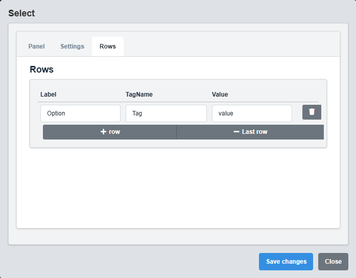
Rows Configuration tab showing option list configuration and selection settings.
The Rows tab controls the individual options and their configuration for the select component.
|
Parameter |
Description |
Format/Options |
Example |
|
Option Label |
Display text for the option |
Text string |
Option 1 |
|
Option Value |
Value associated with the option |
Text or numeric value |
1 |
|
Option Tag |
Data source tag for the option |
Tag name string |
USER.A1 |
Option Configuration Example
Option 1: Label="Production Mode", Value="1", Tag="USER.Mode1" Option 2: Label="Maintenance Mode", Value="2", Tag="USER.Mode2" Option 3: Label="Test Mode", Value="3", Tag="USER.Mode3"
Option Management: Configure each option with appropriate labels, values, and tags to provide meaningful selection choices for users.
3. Troubleshooting
Common Issues and Solutions
|
Issue |
Possible Causes |
Solutions |
|
Options not displaying |
No options configured, API endpoint not responding |
Check option configuration and API endpoint |
|
Selection not working |
Feedback tag not configured, event handlers missing |
Configure feedback tag and check event handling |
|
API options not loading |
Invalid API endpoint, network issues |
Verify API endpoint URL and network connection |
|
Styling not applying |
Invalid color codes, CSS conflicts |
Check color format and CSS compatibility |