Progress Indicator
1. Overview
The Progress component is a versatile visualization widget designed for the Stream platform dashboard. It provides both circular and linear progress indicators with customizable ranges, colors, and display options. The component is perfect for showing completion status, process progress, and value ranges with visual feedback.
This component is particularly effective for:
- Process Monitoring: Display completion status of ongoing processes
- Value Ranges: Show current values within defined ranges
- Progress Tracking: Visual progress indicators for tasks and operations
- Status Display: Show system status with color-coded ranges
- KPI Visualization: Display key performance indicators with progress
- Real-Time Updates: Live progress updates from PLC/SCADA systems
Key Features
- Dual Display Types: Circular and linear progress indicators
- Customizable Ranges: Multiple color-coded ranges for different values
- Dynamic Colors: Color changes based on current values
- Real-Time Updates: Live data updates from data sources
- Flexible Styling: Customizable colors, sizes, and appearance
- Range Indicators: Visual range markers and separators
- Half Circle Mode: Semi-circular progress display option
- Responsive Design: Adapts to different screen sizes
2. Configuration Steps
2.1 Panel Configuration
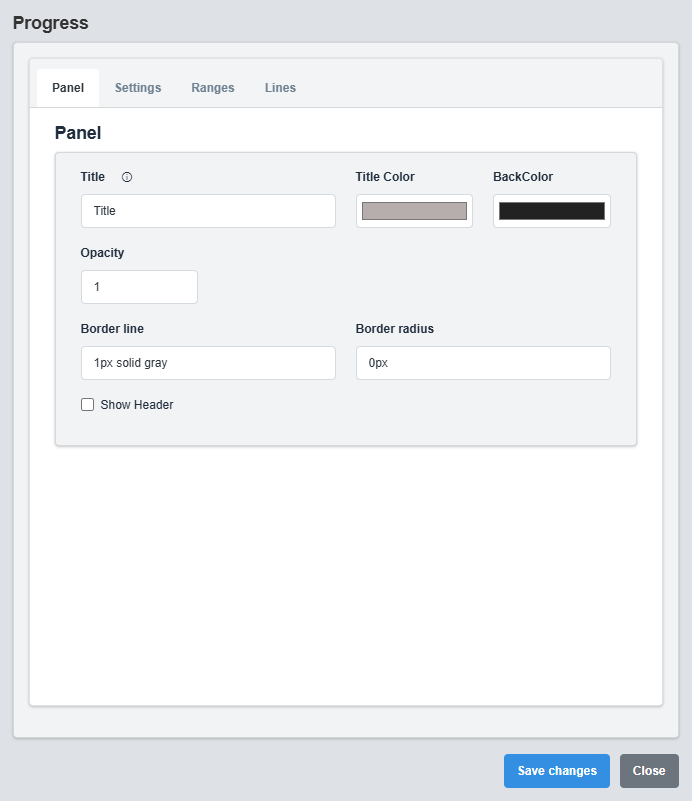
Panel Configuration tab showing basic appearance and layout settings for the progress component.
The Panel tab controls the basic appearance and layout of the progress component.
|
Parameter |
Description |
Format/Options |
Example |
|
Show Header |
Display the panel header with title |
true/false |
false |
|
Title |
Sets the display title for the progress component |
Text string |
Title |
|
Title Color |
Sets the color of the title text |
Hex color code or CSS color name |
#b6adad |
|
Back Color |
Sets the background color for the progress container |
Hex color code or CSS color name |
#222222 |
|
Opacity |
Controls the transparency level of the progress container |
0.0 (transparent) to 1.0 (opaque) |
1.0 |
|
Border Line |
Defines the border style for the container. Supports both full border and side-specific border styling |
CSS border syntax or side-specific syntax (semicolon-separated) |
1px solid gray or left: 2px solid red; top: 1px solid blue |
|
Border Radius |
Sets the corner rounding for the progress container |
CSS border-radius value |
0px |
2.2 Settings Configuration
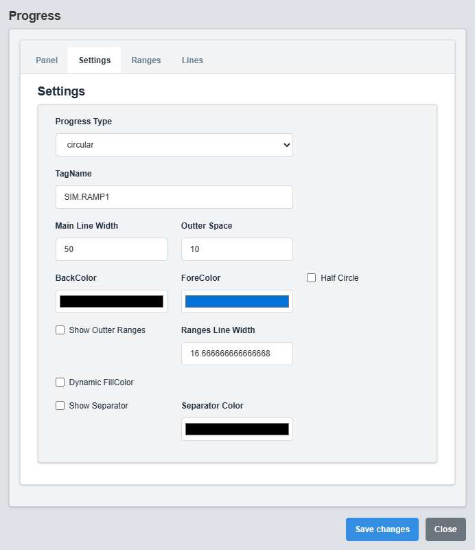
Settings Configuration tab showing display type, colors, and progress bar settings.
The Settings tab controls the display type, colors, and basic progress bar configuration.
|
Parameter |
Description |
Format/Options |
Example |
|
Tag Name |
Data source tag for the progress value |
Tag name string |
SIM.RAMP1 |
|
Display Type |
Type of progress display |
circular, linear |
circular |
|
Main Line Width |
Width of the main progress line |
Numeric value (pixels) |
50 |
|
Outer Space |
Space around the progress indicator |
Numeric value (pixels) |
10 |
|
Back Color |
Background color of the progress track |
Hex color code or CSS color name |
white |
|
Fore Color |
Color of the progress fill |
Hex color code or CSS color name |
MyBlue |
|
Half Circle |
Display as semi-circular progress |
true/false |
false |
|
Dynamic Fill Color |
Change color based on value ranges |
true/false |
false |
Linear Progress Settings
|
Parameter |
Description |
Format/Options |
Example |
|
Bar Height |
Height of the linear progress bar |
Numeric value (pixels) |
20 |
|
Bar V Position |
Vertical padding around the progress bar |
Numeric value (pixels) |
20 |
the visual styling of progress lines, separators, and indicators.
|
Parameter |
Description |
Format/Options |
Example |
|
Show Outer Ranges |
Display range indicators around the progress |
true/false |
false |
|
Ranges Line Width |
Width of the range indicator lines |
Numeric value (pixels) |
16.67 |
|
Show Separator |
Display separators between ranges |
true/false |
false |
|
Separator Color |
Color of the range separators |
Hex color code or CSS color name |
black |
Display Types: Choose between circular progress (traditional circular indicator) or linear progress (horizontal bar) based on your layout and visual preferences.
2.3 Ranges Configuration
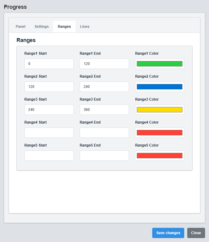
Ranges Configuration tab showing color-coded ranges and value thresholds.
The Ranges tab controls the color-coded ranges and value thresholds for the progress indicator.
|
Parameter |
Description |
Format/Options |
Example |
|
Range 1 Start |
Starting value for range 1 |
Numeric value |
0 |
|
Range 1 End |
Ending value for range 1 |
Numeric value |
120 |
|
Range 1 Color |
Color for range 1 |
Hex color code or CSS color name |
MyGreen |
|
Range 2 Start |
Starting value for range 2 |
Numeric value |
120 |
|
Range 2 End |
Ending value for range 2 |
Numeric value |
240 |
|
Range 2 Color |
Color for range 2 |
Hex color code or CSS color name |
MyBlue |
|
Range 3 Start |
Starting value for range 3 |
Numeric value |
240 |
|
Range 3 End |
Ending value for range 3 |
Numeric value |
360 |
|
Range 3 Color |
Color for range 3 |
Hex color code or CSS color name |
MyRed |
Range Configuration Example
Range 1: 0-120 (Green) - Normal operation Range 2: 120-240 (Blue) - Warning level Range 3: 240-360 (Red) - Critical level
Color-Coded Ranges: Use different colors for different value ranges to provide immediate visual feedback about the current status and level
2.4 Lines Configuration
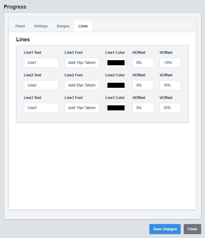
Lines Configuration tab
3. Troubleshooting
Common Issues and Solutions
|
Issue |
Possible Causes |
Solutions |
|
Progress not displaying |
Incorrect tag name, no data source |
Verify tag name and data source connection |
|
Colors not changing |
Dynamic Fill Color disabled, ranges not configured |
Enable Dynamic Fill Color and configure ranges |
|
Ranges not showing |
Show Outer Ranges disabled, range values not set |
Enable Show Outer Ranges and configure range values |
|
Progress not updating |
Data source not active, tag name incorrect |
Check data source and verify tag name configuration |
|
Linear bar not visible |
Display Type set to circular, bar height too small |
Change Display Type to linear and increase bar height |