Tile
1. Overview
The Tile component is a versatile display widget designed for the Stream platform dashboard. It provides a clean, compact way to display key metrics, values, and status information in an easy-to-read format. The component is perfect for KPI displays, status indicators, and real-time value monitoring.
This component is particularly effective for:
- KPI Displays: Showing key performance indicators at a glance
- Status Monitoring: Displaying system status and alerts
- Value Display: Showing real-time numeric values with units
- Dashboard Headers: Creating informative panel headers
- Process Indicators: Displaying process variables and measurements
- Alert Systems: Visual indicators for system conditions
Key Features
- Dual State Display: Different colors for true/false or normal/alarm states
- Icon Support: Display icons with customizable positioning and sizing
- Reference Comparison: Show percentage changes and trend indicators
- Dynamic Text: Custom text based on value ranges
- Real-Time Updates: Live data streaming from PLC/SCADA systems
- Customizable Styling: Full control over fonts, colors, and layout
- Precision Control: Configurable decimal places for numeric values
- Unit Display: Support for measurement units
2. Configuration Steps
2.1 Panel Configuration
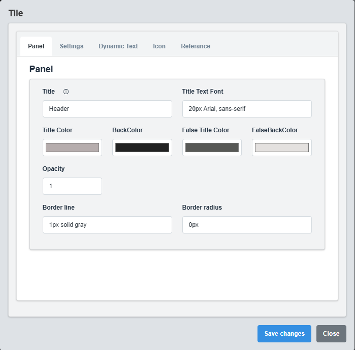
Panel Configuration tab showing basic appearance and layout settings for the tile component.
The Panel tab controls the basic appearance and layout of the tile component.
|
Parameter |
Description |
Format/Options |
Example |
|
Title |
Sets the display title for the tile |
Text string |
"System Status" |
|
Text Font |
Defines the font for the title text |
CSS font syntax |
20px Arial, sans-serif |
|
Title Color |
Sets the color of the title text |
Hex color code or CSS color name |
#b6adad |
|
Back Color |
Sets the background color for the tile |
Hex color code or CSS color name |
#222222 |
|
False Title Color |
Title color when tile is in false/alarm state |
Hex color code or CSS color name |
#585956 |
|
False Back Color |
Background color when tile is in false/alarm state |
Hex color code or CSS color name |
#e4e1df |
|
Opacity |
Controls the transparency level of the tile |
0.0 (transparent) to 1.0 (opaque) |
1.0 |
|
Border Line |
Defines the border style for the container. Supports both full border and side-specific border styling |
CSS border syntax or side-specific syntax (semicolon-separated) |
1px solid gray or left: 2px solid red; top: 1px solid blue |
|
Border Radius |
Sets the corner rounding for the tile |
CSS border-radius value |
0px |
Dual State Colors: The False Title Color and False Back Color are used when the tile is in an alarm or false state, providing visual feedback for different conditions.
2.2 Settings Configuration
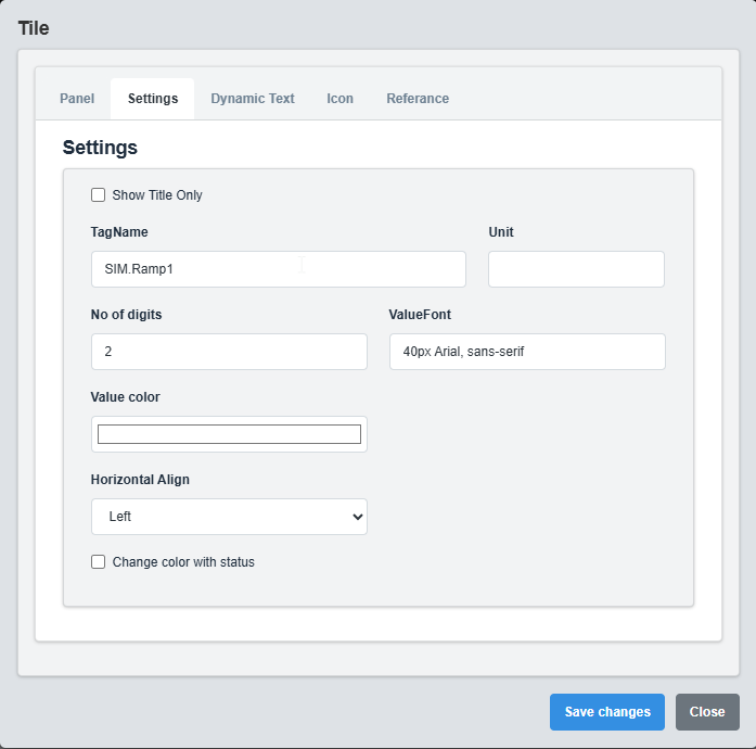
Settings Configuration tab showing data source, display options, and formatting settings.
The Settings tab controls the data source, display options, and formatting for the tile.
|
Parameter |
Description |
Format/Options |
Example |
|
Title Only |
Display only the title without value |
true/false |
false |
|
Tag Name |
Data source tag for the tile value |
Tag name string |
SIM.Ramp1 |
|
Precision |
Number of decimal places to display |
Numeric value (0-10) |
2 |
|
Unit |
Measurement unit to display after the value |
Text string |
°C, %, bar, rpm |
|
Value Color |
Color of the displayed value |
Hex color code or CSS color name |
#ffffff |
|
Value Font |
Font for the displayed value |
CSS font syntax |
40px Arial, sans-serif |
|
Change Color With Status |
Change colors based on tag status |
true/false |
false |
|
Horizontal Align |
Horizontal alignment of content |
left, center, right |
left |
Title Only Mode: When enabled, only the title is displayed without any value, useful for creating header tiles or status indicators.
2.3 Dynamic Text Configuration
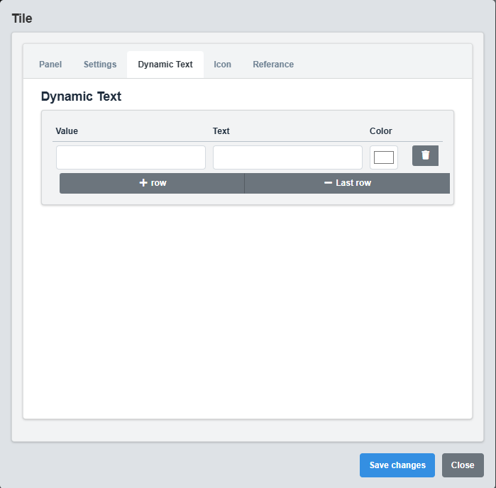
Dynamic Text Configuration tab showing settings for custom text based on value ranges.
The Dynamic Text tab allows you to display custom text based on the tile's value.
|
Parameter |
Description |
Format |
Example |
|
Value |
Value threshold for this text |
Numeric value |
50, 80, 100 |
|
Text |
Text to display when value is reached |
Text string |
Normal, Warning, Critical |
|
Color |
Color for this text |
Hex color code |
#ffffff, #ffff00, #ff0000 |
Dynamic Text Configuration Example
Value: 0 Text: "Offline" Color: #ff0000 Value: 50 Text: "Normal" Color: #00ff00 Value: 80 Text: "Warning" Color: #ffff00 Value: 100 Text: "Critical" Color: #ff0000
Dynamic Text Usage: This feature allows you to display status text instead of numeric values based on predefined thresholds, making it ideal for status indicators and alarm displays.
2.4 Icon Configuration
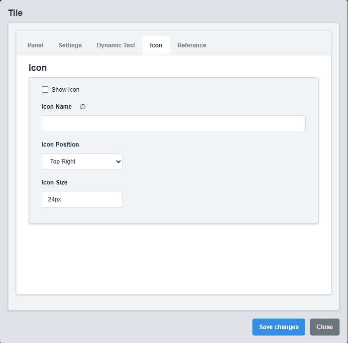
Icon Configuration tab showing settings for displaying icons on the tile.
The Icon tab controls the display of icons on the tile.
|
Parameter |
Description |
Format/Options |
Example |
|
Icon Name |
Filename of the icon to display |
Image filename in StaticResources folder |
icon.png, warning.svg |
|
Show Icon |
Enable or disable icon display |
true/false |
false |
|
Icon Position |
Position of the icon on the tile |
Top Left, Top Right |
Top Right |
|
Icon Size |
Size of the displayed icon |
CSS size value |
24px, 32px, 48px |
Icon Usage: Icons are useful for providing visual context to the tile content, such as warning indicators, status symbols, or measurement type indicators
2.5 Reference Configuration
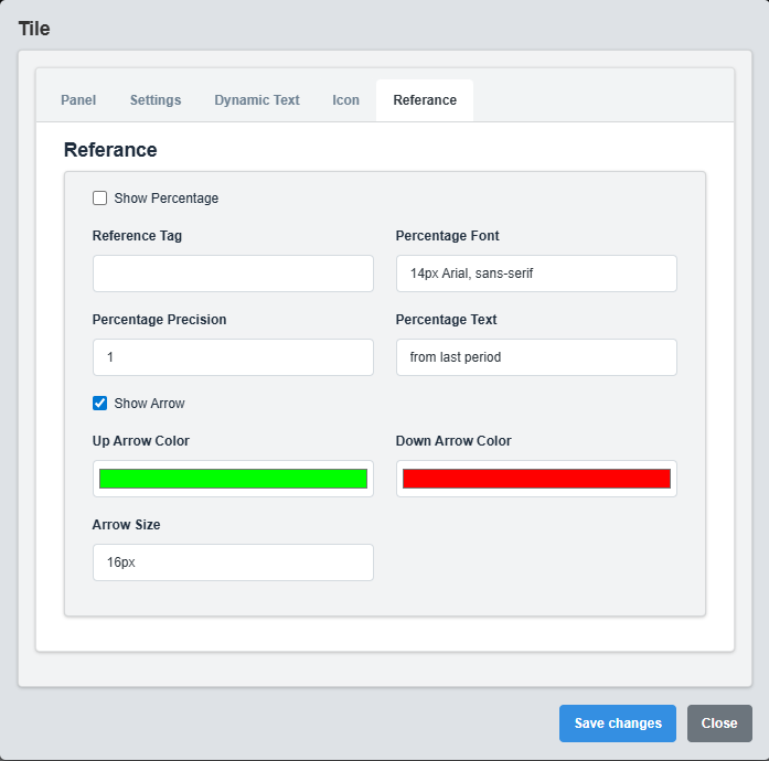
Reference Configuration tab showing settings for percentage comparison and trend indicators.
The Reference tab controls percentage comparison and trend indicators.
|
Parameter |
Description |
Format/Options |
Example |
|
Reference Tag |
Tag name for comparison reference |
Tag name string |
SIM.Ramp1_Ref |
|
Show Percentage |
Display percentage change from reference |
true/false |
false |
|
Percentage Font |
Font for percentage display |
CSS font syntax |
14px Arial, sans-serif |
|
Up Arrow Color |
Color for positive change indicator |
Hex color code |
#00ff00 |
|
Down Arrow Color |
Color for negative change indicator |
Hex color code |
#ff0000 |
|
Show Arrow |
Display up/down arrow indicators |
true/false |
true |
|
Percentage Precision |
Decimal places for percentage display |
Numeric value (0-3) |
1 |
|
Arrow Size |
Size of the arrow indicators |
CSS size value |
16px |
|
Percentage Text |
Additional text for percentage display |
Text string |
from last period |
Reference Comparison: This feature allows you to compare the current value with a reference value and display the percentage change with visual indicators (arrows) showing whether the change is positive or negative.
3. Troubleshooting
Common Issues and Solutions
|
Issue |
Possible Causes |
Solutions |
|
Tile not displaying data |
Incorrect tag name, data source not available |
Verify tag name is correct and data source is active |
|
Icon not appearing |
Incorrect icon filename, Show Icon disabled |
Check icon filename and ensure Show Icon is enabled |
|
Percentage not calculating |
Reference tag not configured, Show Percentage disabled |
Set Reference Tag and enable Show Percentage |
|
Dynamic text not working |
Value thresholds not properly configured |
Verify value thresholds and text configuration |
|
Colors not changing with status |
Change Color With Status disabled |
Enable Change Color With Status option |