Table
1. Overview
The Table component is a structured data display widget designed for the Stream platform dashboard. It provides a clean, organized way to display tabular data with customizable styling, row management, and real-time updates. The component is perfect for displaying structured information, data summaries, and organized content in an easy-to-read format.
This component is particularly effective for:
- Data Display: Present structured data in organized rows and columns
- Information Tables: Display configuration parameters and settings
- Status Lists: Show system status and monitoring information
- Data Summaries: Present key metrics and values in tabular format
- Configuration Tables: Display system configuration and parameters
- Real-Time Updates: Live data updates from PLC/SCADA systems
Key Features
- Structured Display: Organized table format with rows and columns
- Customizable Styling: Full control over colors, fonts, and appearance
- Row Management: Flexible row configuration and data management
- Real-Time Updates: Live data updates from data sources
- Responsive Design: Adapts to different screen sizes
- Data Formatting: Consistent data presentation and formatting
- Easy Configuration: Simple setup and configuration process
- Professional Appearance: Clean, modern table design
2. Configuration Steps
2.1 Panel Configuration
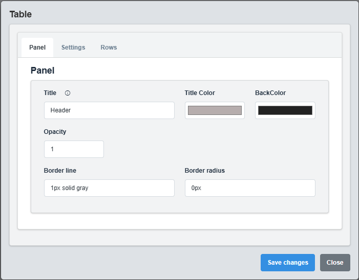
Panel Configuration tab showing basic appearance and layout settings for the table component.
The Panel tab controls the basic appearance and layout of the table component.
|
Parameter |
Description |
Format/Options |
Example |
|
Title |
Sets the display title for the table |
Text string |
Header |
|
Title Color |
Sets the color of the title text |
Hex color code or CSS color name |
#b6adad |
|
Back Color |
Sets the background color for the table container |
Hex color code or CSS color name |
#222222 |
|
Opacity |
Controls the transparency level of the table container |
0.0 (transparent) to 1.0 (opaque) |
1.0 |
|
Border Line |
Defines the border style for the container. Supports both full border and side-specific border styling |
CSS border syntax or side-specific syntax (semicolon-separated) |
1px solid gray or left: 2px solid red; top: 1px solid blue |
|
Border Radius |
Sets the corner rounding for the table container |
CSS border-radius value |
0px |
Container Styling: The panel settings control the container that holds the table, providing the overall appearance and layout structure.
2.3 Settings Configuration
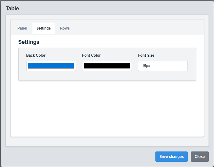
Settings Configuration tab showing display options, styling, and formatting settings.
The Settings tab controls the display options, styling, and formatting for the table.
|
Parameter |
Description |
Format/Options |
Example |
|
Font Color |
Color of the table text |
Hex color code or CSS color name |
MyWhite |
|
Font Size |
Font size for the table text |
CSS font-size value |
15px |
|
Back Color |
Background color for table cells |
Hex color code or CSS color name |
MyBlue |
|
Header Color |
Background color for table headers |
Hex color code or CSS color name |
#34495e |
|
Alternating Rows |
Use alternating row colors |
true/false |
true |
|
Alternate Color |
Color for alternating rows |
Hex color code or CSS color name |
#f8f9fa |
|
Border Style |
Style of table borders |
solid, dashed, dotted, none |
solid |
Table Styling: Configure colors, fonts, and formatting to create a professional and readable table display that matches your dashboard theme
2.2 Settings Configuration

Settings Configuration tab showing display options, styling, and formatting settings.
The Settings tab controls the display options, styling, and formatting for the table.
|
Parameter |
Description |
Format/Options |
Example |
|
Font Color |
Color of the table text |
Hex color code or CSS color name |
MyWhite |
|
Font Size |
Font size for the table text |
CSS font-size value |
15px |
|
Back Color |
Background color for table cells |
Hex color code or CSS color name |
MyBlue |
Table Styling: Configure colors, fonts, and formatting to create a professional and readable table display that matches your dashboard theme.
2.3 Rows Configuration
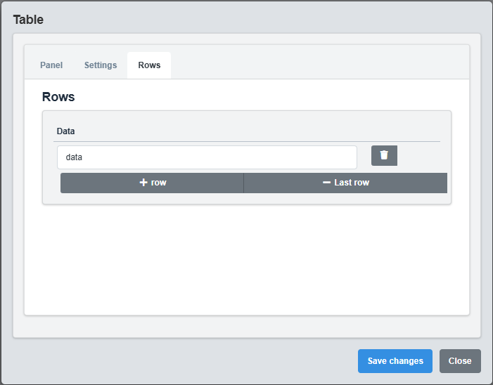
Rows Configuration tab showing table row configuration and data management settings.
The Rows tab controls the individual table rows and their data content.
|
Parameter |
Description |
Format/Options |
Example |
|
Data |
Content data for the table row. Data is separated by semicolons (;) and can be static strings or tag names |
Semicolon-separated values (strings in quotes or tag names) |
"Temperature";SIM.Temp1;"Pressure";SIM.Press1 |
Data Format Specification
The Data field supports two types of content separated by semicolons (;):
|
Data Type |
Format |
Description |
Example |
|
Static String |
Text enclosed in quotes |
Fixed text that doesn't change |
"Temperature", "Status", "Value" |
|
Tag Name |
Tag name without quotes |
Real-time data from PLC/SCADA systems |
SIM.Temp1, USER.Status, PLC.Pressure |
Data Separation Examples
// Single column with static text Data: "Temperature" // Single column with tag data Data: SIM.Temp1 // Multiple columns: static text and tag data Data: "Temperature";SIM.Temp1;"°C" // Multiple columns: mixed static and tag data Data: "Status";USER.Status;"Value";SIM.Value1;"Unit";"bar" // Header row with multiple columns Data: "Parameter";"Value";"Unit";"Status"
Data Processing Rules:
- Quoted strings are displayed as static text
- Unquoted values are treated as tag names and display real-time data
- Semicolons (;) separate columns within the same row
- Image support: Tag values ending with image extensions (.jpg, .png, .gif, etc.) are displayed as images
3. Troubleshooting
Common Issues and Solutions
|
Issue |
Possible Causes |
Solutions |
|
Table not displaying data |
No rows configured, incorrect data format |
Configure table rows and verify data format |
|
Styling not applying |
Invalid color codes, CSS conflicts |
Check color format and CSS compatibility |
|
Text not visible |
Font color same as background, opacity issues |
Adjust font color and check opacity settings |